Updating Chat Colors

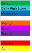
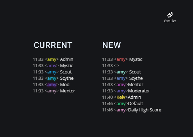
In response to feedback that the chat colors associated with various player roles are not well differentiated, we’ve put together this update that should more clearly distinguish Mystic, Scythe, Scout, Mentor, Moderator, and Daily Top Score.

chat-colors-update

Let us know if you have any feedback. Hoping to roll out this week.

Thanks Daniela for picking out this nice palette!

Amy

6 Likes

No more glowing anything? I kinda like the look of the glow. :slight_smile:

And on my screen scythe and mod look very similar, maybe one of them could become glowing?

1 Like

For simplicity we have removed glow. It’s pretty hard to make the colors all distinguishable. Hopefully this is an improvement.

I think the roles are mostly easier to distinguish now but agree with atani that scythe and mod are very alike in new colours, i think using old scout colour for the scythes could be easier to see the differance.

glow is nice to have but perhaps this could be used in some way for major competitions or even a automated glow awarded for the next day for the players making highest scoore and acc each day in the future?

But could you please invite us to beta test the colours before you release them so they can be seen under different conditions?

2 Likes

It could be fun to reserve glow for competitions.

We’ve rolled out a test on eyewire.org so you can see how they look there!

Could anyone provide more thoughts on why you like glow?

It’s kinda hard to put into words. For me it makes the promoted positions feel extra special. Just that extra added sparkle that gives warm fuzzies.

4 Likes

It glows! What’s not to like?

I also think it gives an added air of authority. The admins look less impressive without the glow, imo.

(thank y’all for keeping grimmy shiny though!)

1 Like

I’m with Atani about liking the glow. I would say a happy medium is that people with assigned roles (so not regular or advanced player) would have a glow. That’ll be a nice distinguisher to prevent confusion.

The glow is what draws attention to a username. It’s an extra feature that stands out. Like without the glow but a color change, it’s one bump up. The glow is like a double upgrade!

I’ll be honest, the new color scheme’s still confusing. So many similar colors from blue -> purple -> red. The yellow’s ok, but that’s pretty much it. It would be nice to have a scheme, where people could tell leveling up by the color, but that’s my opinion. I would say the lower levels can be green (like regular and advanced player), the scout is red, scythe is orange, mentor is blue, mystic is teal, and admin/daily high score stay the same.

I couldn’t distinguish between purple of mods and glowpurple of mystics, and i have a good screen. So adding glow not relevant to me…
Mentor, Scout, Scythe is a related group as to function, so i would give colors of same group, like:
chat%20farben

2 Likes

Several of those colors are too dark. In chat everything needs to be pretty bright.

Hopefully the new colors are an improvement.

We hear the glow love and will be bringing it back! / this is Amy not sure why I was signed into a test account

2 Likes

The glow will be back shortly for: Scythes, Mystics, Moderator, and Admin.

image

1 Like

The first thing is we should know what is the purpose of coloring nicknames? If it is only about being cool and showing off your position or just wearing the outfit you like then… who cares ;d just let me use red :smiley:

But if the purpose of it is more practical… for example the easy and quick way to recognize ppl who can do specific things, then I think it should be reworked from that perspective. Which role is important for others to quickly recognize? I think that only scythes / mentors / admins are essentially important to be spotted quickly. Mystics are irrelevant from the point of view of most players and they already have their own chat tab. Similar with mods. It is not important to see who is mod. But idd it is important to see who can reap, who can help in cube, and who is able of doing unique things like admins can do. Then we only need 3 colors and separate way of saying who is also a mentor. For example:
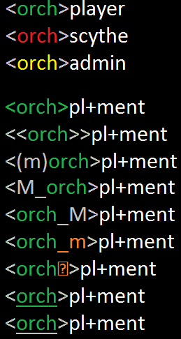
chat_colors
That way it would be also easy to introduce new players to most important distinction in powers. And help them to spot in chat the one they need at the moment. Also it would be nice to have some counter of online roles when logging into chat like:
online players: orch, orch, orch, orch, orch, orch, orch, orch, orch…
online scythes: orch, orch
online mentors: orch, orch, orch
For me personally it is more important then showing off. For that purpose maybe we can do sth in ladder? Like colors in ladder? or emblems or sth like that?
There are a couple different ways that the colors function.

  1. Colors can be used to identify certain roles for practical purposes. For example, if an Admin or Mod asks you to cease a certain behavior in the chat, their chat color can indicate that they have the authority to make such a claim and they may enact that authority if their requests are ignored. Players may want to direct specific questions to Scythes or Mystics who have the power to fix mergers. Mentors may wear their mentor color when asking another player if they want help with their cube.

  2. Colors are achievements and indicate a certain level of expertise has been gained by a player. A Player may be proud of their promotion to a given role, and will like to use their color in chat as a badge of honor showing their level in the game.

So, to answer your question, chat colors are both practical as well as fun achievements and that’s why we have a different one dedicated to each type of player.

Glow is live again.

but problem is that this hierarchy is not linear so practical aspect of just picking a color from available ones makes it kinda useless :stuck_out_tongue: