The first Beta Day: Fix for Confusing Submit/Review/Reap Colors

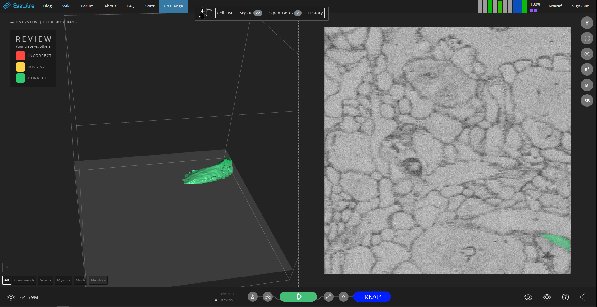
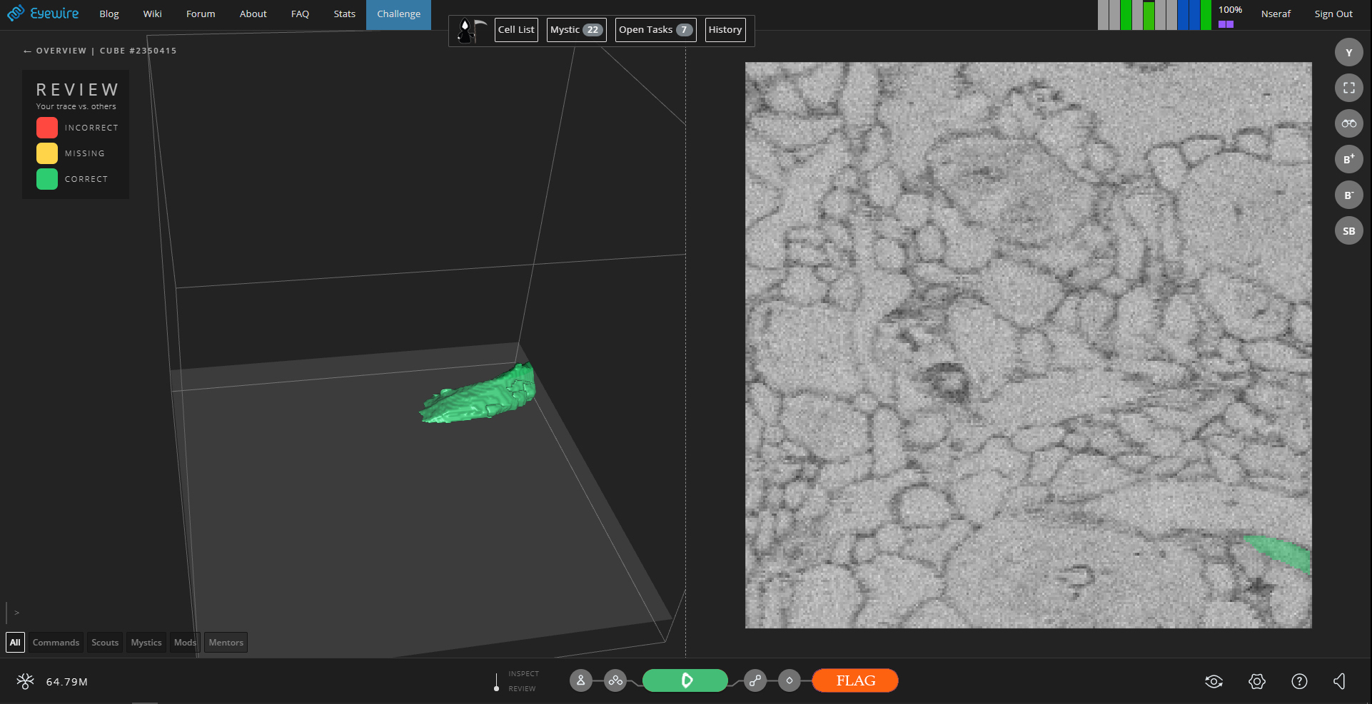
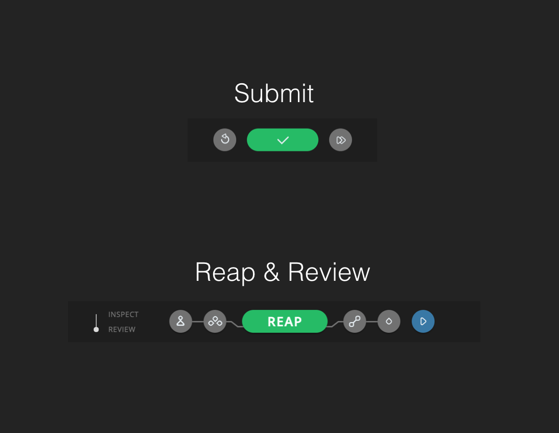
Several players sent in feedback saying it’s easy to accidentally reap or flag a cube in the new reap from review feature as the interfaces look very similar to normal submit.

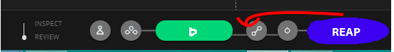
The first fix thought was to switch the location of Flag/Reap with the blue Continue button. But this actually introduced an even worse complexity, as the interface would need to change back and forth with toggle from Review to Inspect, meaning the reap button would move from one spot to another as you switch between review and reap. Yikes!

Second iteration, which will be our first beta day, is an altered color scheme for Reap, Continue, and Dupe. These icons should make it more visibly clear when you are Reaping. Red Dupe will capture attention and Scythe Blue will be the reap color. Green will be conserved for “start playing” and “submit/move on.”

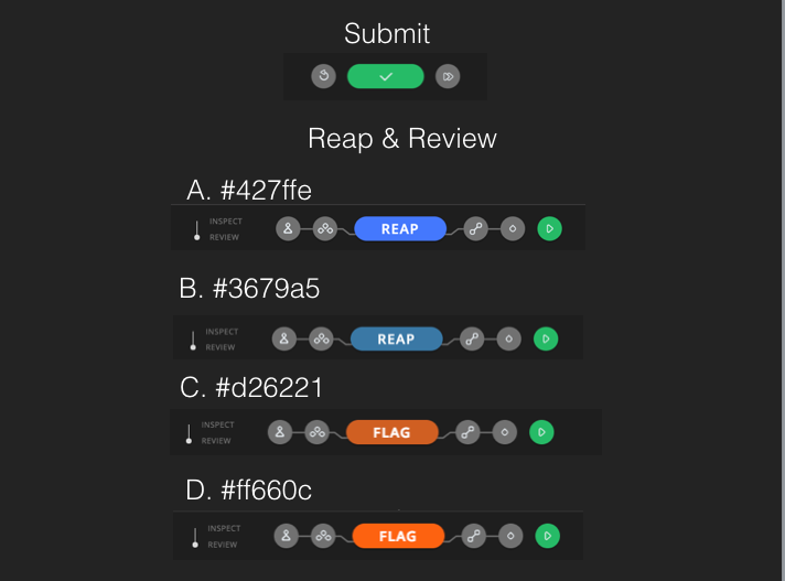
To test, check out a live version on beta.eyewire.org/login in a chrome incognito window. Options A and C are deployed as proposed final colors. You can play around with different colors by opening developer tools, inspecting the Flag/Reap button, and plugging in a different hex codes from the color options A-D # in the image above.

This will be live for at least 24 hours on the test server.

4 Likes

test server being chris.eyewire.org/login in incognito window?

In here in pic I like A and D better.

That’s correct. I would view it on the test server so you can see the color near the cube that you will be playing.

1 Like

yep will do. :slight_smile: ty

1 Like

actually for the hexes to work you need to paste this: (at least for scythe reap button)

document.getElementById(‘saveGT’).style.background=“replace with hex code”

and since can’t paste from a picture lol for ease:

"#427ffe
"#3679a5
"#d26221
"#ff660c

and having tried them in the test server I think I’d go with A+D. But I think for most (who i’ve heard having a prob) the colour is not so much the issue as the position of the button(s).

Actually, the colors work on the beta server (as is in the first post), not in the chris.

And I like all colors, but hope that it will be either A+D or B+C.

1 Like

:star:It is just my opinion!:star: How about choosing color in settings? Just like choosing paint color in settings tab. But it could be 2d palette.

Just like this

1 Like

Found a set of colors that are both impossible to ignore and appealing to the eyes:

3 Likes

why does that say FALG? xD

1 Like

lol
FALG!!!

1 Like

Is the decision to not move the reap button over purely an aesthetic preference? Toggling between inspect and review doesn’t change my buttons at all. So if review and inspect were both changed there would be no odd toggling between them. It would make more sense to swap it with the position of the onward button as that would create uniformity throughout all screens with an onward button (the regular tracing screen as well as the points report screen).

For me, you can make that reap button obnoxious dayglo pink and i’m still going to hit it just due to the fact it’s located in the same place as the onward buttons are on the two other screens.

If I have to choose between colors I think I prefer a and d, but really don’t think changing the color is going to make a lot of difference to players in the “zone” :slight_smile:

3 Likes

I think Atani’s correct in that the color of the button won’t really have any affect on my automatic tendency to just click the button that’s in the ‘onward’ position since we’re all so accustomed to it it’s practically a reflex.

She brings up a good point in that right now it doesn’t really appear that inspecft and review have any discernible difference in practical functionality. So to solve both issues it may make more sense to have the ‘reap’ button only available when you are in ‘inspecft’ mode, while in review mode it shows the ‘onward’ button.

While some may accidentally click ‘onward’ while intending to reap it’s not that big of a deal to go into history and go back to the cube, while accidentally reaping something cannot be undone.

3 Likes

This is what i’m kinda thinking. Apologies for my awesome mspaint skills!

3 Likes

I agree with both galarun and Atani and I made a couple of better photoshopped images ( :stuck_out_tongue: ) to show what could work for us (players who value functionality a tad more than aesthetics when/if both can’t be attained.)


Although I don’t know why these two don’t offer both (aesthetics and functionality).

1 Like

The only problem with not seeing reap/flag in “review” and seeing it in inspect is that in inspect you don’t get to see the changes, so if you traced a huge branch, and it is missing, in review you can just reap all that yellow in whereas in inspect even in review mode you’d have to re-trace it all lol.

1 Like

i agree that it is mostly the placement and size that is wrong, and like atani`s version of it with two big buttons, but is wondering if it would be better to have the two buttons beside each other in the middle.

also i am not sure how useful it is to reap from review since it is often that there are mergers in review that is not really part of consensus, have not tested how this work when toggling from review -> inspect but so far i have used inspect from ov to get the whole picture when reaping. like this example where the correct trace with big light blue part is marked as good in review/inspect but when looking at consensus from overview it is seed only and will probably have to be reaped in (was second player of this cube)

2 Likes

I think the good part of reaping from review isn’t when there are mergers, which true most are not part of consensus, but when you trace a (large/huge) branch it’s not in and you’d have to go inspect retrace all of it and reap. Now you just reap lol. I don’t know if Reap should be next to play I think it might cause some accidental reaps/flags still. I think placing it on the edge differentiates it better from play/proceed. At least imo.

1 Like

i do not reap much out of review, just sometimes with huge part missing as Nik said. Often normal scythe-view and review-view show different things i am not sure what’s in and what not (seems to depend on cube-weights), so i normally reap from normal scythe-view. As to the buttons, i would prefer A and D as proposed by Amy above.

1 Like

Thanks for the feedback so far, everyone! As of right now, the GMs have read your additional suggestions, and these are our concerns about implementing them:

a) It sounds like some of you are asking that the “reap/flag” button remain in Review, but you want it to trade places with the “move on” button. By having a larger button off to one side, this may crowd the bottom of the browser window on smaller screens, and the smaller screen issue was actually one reason that the Review/Inspect UI was changed. It may also be difficult for Chris to have the buttons configured one way in Review and another way in Inspect.

b) It sounds like some of you are alternately asking that you only be able to reap or flag from Inspect, and that you simply want to use the Review/Inspect toggle to make the “reap/flag” button appear as needed. We were under the impression previously that Scythes and Scouts have to reap/flag frequently enough to prefer having the ability to simply hit that button without having to switch to Inspect or needing to re-do the whole trace first.

I’m not saying that we absolutely can’t implement either of these suggestions, but if we decide here that we can’t, those above concerns are the likely reasons why not (and why we had so far only changed the colors). If we decide that we can/should try one of these suggestions, there will still have to be a choice, and it may not make everyone happy. When the GMs have had time to touch base with the rest of HQ about this, we’ll let you know.

In the meantime it sounds like A+D is the favored color combo, and we hope that having the extended time on the beta site allowed more of you to test at a convenient hour!

1 Like

i will admit that my preferred method is using the disable leaderboard option and looking at the stat script to get accuracy and if needed inspect that cube and use R to review my trace in that cube. This is mostly because without leaderboard it goes faster to get the new cube, and not really loosing anything. but as i understand it this method is only working for mystics so far. if the R button had worked for scouts and scythes and the accuracy bars in the stats script was part of ew this could be a option for all promoted players

3 Likes