Software ergonomy

software ergonomics

Dear,

I have used the program and have some reflections concerning the ergonomics of the software.

Q1: Why is the menu placed on the right side of the screen?
Is it not better in the middle between 3D and 2D?
Advantage: we always works in the center of the two fields! So shorter moving to the menu when he stands in the middle (horizontally and vertically)

Q2: Why is the menu “Exploring - Commit - Discard” at the bottom and not at the button “Explore mode”? (And, as with Q1: in the middle of the screen)

Q3: Can the “Explore” mode not be indicated by the color of the cursor? (Already mistaken me several times)

Q4: Why not in 2D the Function 2x click the middle button (scroll wheel) = zoom:0 and center?

1 Like

Hi ggeu,

Thank you for your suggestions!

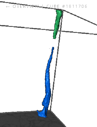
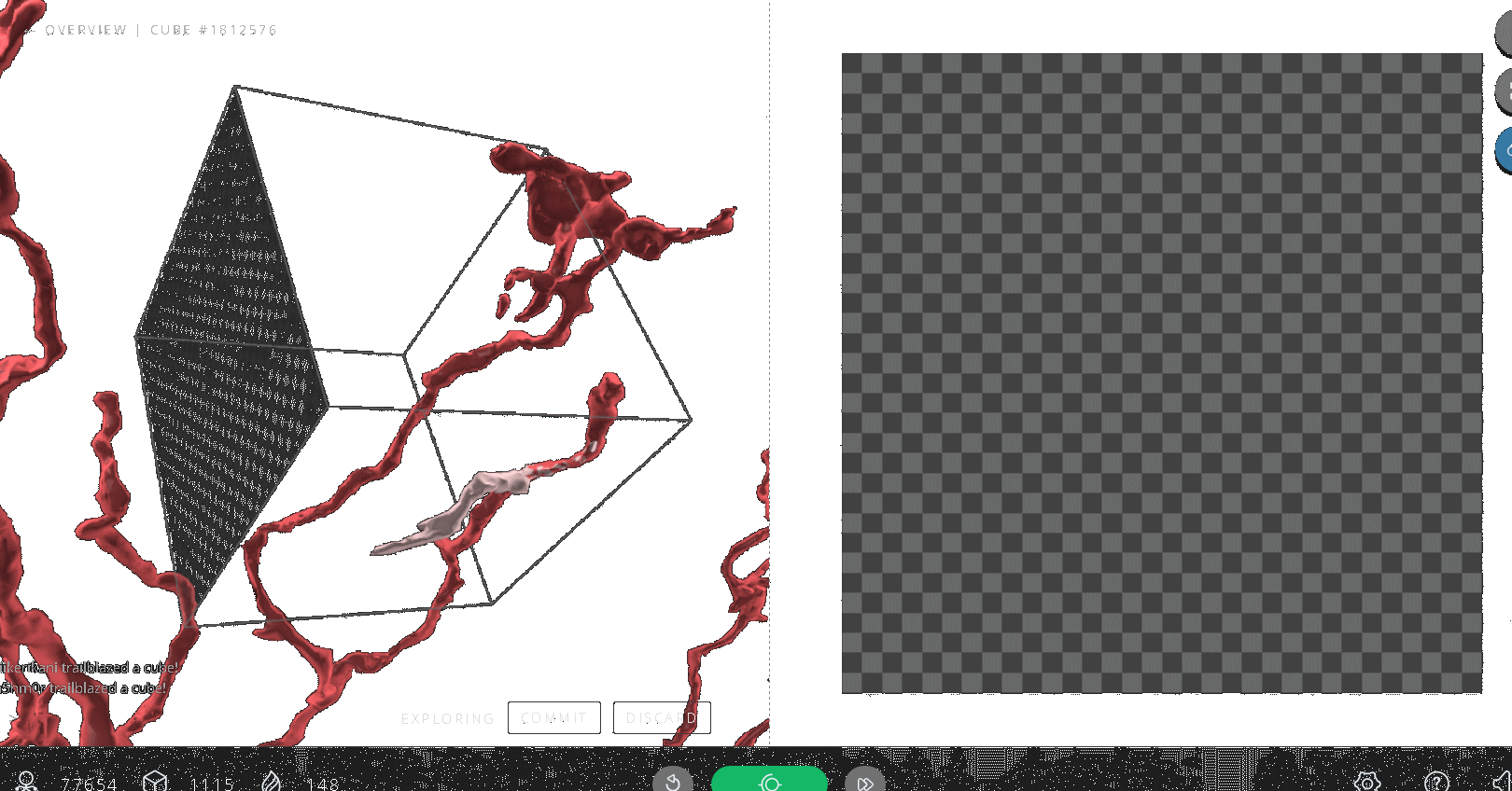
Q1: We chose to the have the toolbar on the right for the a few reasons (and after some tests). The buttons on the right apply primarily to the use of the 2D slide (flip slide orientation, zoom in on 2D and select segments using explore mode). Also, this allows for better dynamic sizing for screen sizes. A toolbar in the middle causes scaling problems between the 2D and the 3D. We need those areas as big as possible for the browser screen. Finally, we prefer not to interrupt the “flow” or “connection” between the two fields. Each field informs the other and you’ll find that players compare 2D to 3D and vice versa while tracing. Placing buttons between the two causes a “visual” pause and it breaks up the connection between the two fields – not very efficient!

Q2: Good point! Those buttons are supposed to be so that you look over your work in the 3D before “committing” or “discarding” segments. However, I can understand placing those near each other. There are also keyboard command shortcuts you can use so you don’t have to drag your mouse over there.

Q3: Also, a good point! I’ll be sure to recommend this to our devs.

Q4: I’m guessing you use the zoom feature on the 2D. We use the middle mouse button for some other commands including panning while zoomed in on the 2D. The easiest thing is to zoom in and out where your mouse is hovering over the 2D slide using the spacebar. This will center the slide around your mouse when zoomed in (or reset the slide to zoom=0 status). You can also toggle the square bracket button above the explore mode button.

Hope that helps answers your questions! If you have any questions about keyboard shortcuts, please check out the “?” button menu on the bottom right of your screen. All the commands are explained there.

Best,
M.

3 Likes

Dear,

Thanks for your replays.

Q1 - sorry but I have an other suggestion for Q1 (place of the command buttons)

You are in 3D for evaluating of your work.
If you want to start edting in an other direction you have to switch axis.
The button for selecting a different axis (x, y, z) is in the upper right corner.
This is for the selection of a plane in the 3D !
You have to click 2x to go from X to Z, from Y to X or from Z to Y.
Often you must then click again in 3D on the opposite side in order to have the side where you want to begin.
Is it not possible to click in 3D on the desired side of the cube (click LMB and RMB-click are not used in 3D, only drag).
Both mouse buttons can be used and must be used because there are always two sides behind the cursor: one side in the front and one side at the back.
So:
LMB click = front side
RMB click = back side

1 Like

Hi ggeu,

Thanks again for the suggestion! I understand what you are saying however, it’s not quite possible given that we use both right and left mouse buttons to select/deselect segments. If the segments are on the edge of the cube or if you’re zoomed in on the 3D, then we’d have some trouble making sure certain mouse clicks were doing what they’re supposed to be doing. Most Eyewire players use the keyboard in partnership with the mouse. You can use the left/right arrow keys or the a/d keys to cycle thru what plane you’d like start scrolling/working on. I suggest having a look at the shortcuts menu accessed by the “?” button.

Best,
M.

Extra pro-tip: You can double click on any spot on the 3D segments, to jump the 2D plane to that area.

2 Likes

Dear sorek_m,

Thank you for answering my questions so detailed.

Possibly you think “he’s back there” but I try to brainstorm for a better and faster work environment.
I am retired now but on my previous job I was responsible for a CAD-CAM environment where people used
Unigraphics software for developing molds with “surface modeling”.

However, I have noticed something:

Q5: the three colors that are using now are very difficult to distinguish from each other.
There is only one color scale where the three tints for “data” - “Explorer” and “commit” are derived from.
eg:
for blue we get this:

  • dark blue
  • light blue
  • green
    for green we get:
  • light green
  • lighter green
  • light blue
    Why not giving the opportunity to select a color for the three environments?
    So the user can colors with more contrast such as: red - yellow - blue?

Q6: Why is the “Settings” menu divided into two parts: a start (6 items) and “More”?
Why not show the entire menu (entire height of the screen): starting with 6 most importent items and the rest
underneath by category?

1 Like

Hi ggeu,

Thank you for your questions! Please note that we are a very small team with only a couple of developers so we’re somewhat limited in what we can accomplish right now. We certainly have our own UI goals and wishlist we’d love to be able to implement!

To respond to your questions:

Q5: While we don’t have a primary color palette available, there is an option to change what colors you see when tracing in a cube. Under the settings menu, there is a paint color slider that you can slide to change the colors. We provide this for people who have trouble distinguishing certain colors - one of our own admins adjusts the color so that the seed piece is green rather than dark blue.

Q6: The settings menu is currently setup to provide quick access to some buttons that players may generally access more than others. Rather than loading the large-scrollable window. As I’ve stated, we’re aware that there are some perhaps more ideal ways to present the information.

Best,
M.

1 Like

Q5: you can change colouring/seed colours from gear cog icon low right screen.

as for the q6 i imagine so that we’re not swamped with settings after clicking the icon, you get some then if you scroll you get the rest. :slight_smile:

1 Like

Best Seraf,

Some brainstorms:

Q6: Menu:
My opinion is that, if you want something in a menu, you do not need the work environment.
So one can use the entire screen to display all options.
Possibly arranged in areas of interest or topic.
If you still want to see the results of the chosen change in the workspace, make the background transparent.
I think this is a major flaw in many programs, even from Microsoft.

Q7: Switch to Overview:
I always use the Overview to see the adjacent cubes to evaluate with what I have made.
Upon returning to the workspace, rotating and zooming the cube in 3D is very confusing.
Thereby I have absolutely no sight what should be the next adjustments.
Is it not possible to use the same coordinates and zoom values when the environments change ?

Q8: Working in Overview:
If you want to see an overview for evaluation, it is sufficient to see only the adjacent 26 blocks and not the entire neuron.
This would give a much clearer overview in turning and zooming.
Or just stay in the 3D environment but show the surrounding 26 cubes.

1 Like

Well the problem with overview is that it is the illustration of the consensus and consensus can be very very very wrong. Also seeing adjacent branches could/can be confusing as you may add something that may not connect to the seed/trace and no other player will add and scythes/admins will not reap in as it goes through different cubes and it does not need to be added to that cube.

Still if you want you can disable the overview transitions from the gear cog icon that should stop the spinning and zooming in/out and/or you can at any time escape to overview and re-start playing to go back to your cube. (that has a bug in firefox and doesn’t work, will give you a different cube after).

Finally in my opinion it is good to be able to see the whole neuron even when playing as it can give you an idea of if you are tracing on a merger or not, personally the only times I escape to overview is when I want to check if something’s an AI merger or when I am getting cubes that are weird for the cell imo and want to check if there’s a merger (branch) so that I can go and (hopefully) remove it.

1 Like

Dear Nseraf,

Thanks for the answers.
I changed the setting for the animation and it’s already much better but still, when I return to the workplace, the cube flips over.
Is it possible to use the direction of the coordinates of the overview so that you get a stationary image and not disoriented cube every time?

I use the overview to see if at my borders there is a continuation or not because sometimes the seed has 2 beginnings.
Also when I end with 2 endpoints if there is a known sequel or that i have mist something and added too much.

2 Likes

you can change the axis with a/d and/or left/right arrow and yeah sorry forgot to mention that it’ll change axis every time you escape to overview and back. And no it’s programmed that it does that so I don’t think there’s any way to change it. I think the reason behind it is that if you go to overview it gives you a dif. axis after to “freshen your eyes on the cube”.

1 Like

Dear,

I have done some tests and the transition from workspace to overview is OK.
It is only when returning from overview to workspace that there is a jump to another basic coordinate.
Is it not possible when there is a switch to the overview, to buffer the coordinate values ​​of the workspace and use them back on returning?

I understand that due to certain reasons it is difficult to make changes in the software and that I still have much to learn in order to properly deal with the program.
When I was working with the surface modeling software there were regularly meetings with the developers of the program.
In these meetings the latest features were presented.
But where we also could put our thoughts, questions and ideas on new functions or methods.
My thoughts are also some findings and they give an idea of ​​how a user can contribute to potential improvements.
The insights of an outsider can sometimes help to look at a different approach to a problem or situation.

2 Likes

Hi ggeu,

Thank you for all your questions and suggestions. We certainly take them into consideration, however please note that we are an extremely small team with only a couple of developers. Thus, we have to choose what projects to prioritize and focus our efforts on. We are aware of the orientation change that occurs after using the “go back to overview” button. As Nseraf said, the “fresh angle” is part of the idea as well as the fact that using this method is an “undocumented feature” that occurs for Chrome users. We do have ideas on how to improve and implement seeing the “parent cube” for all of our players.

Best,
M.

2 Likes

Dear,

This is why “Overview” is useful:
In cube 1811706 returns the neuron in the cube and this is a decision by viewing the Overview.

1 Like

this is why you should not use overview, that trace goes through other cube(s) and while you may add it no one else will and/or scythes/admins may remove it causing your accuracy to drop. If it doesn’t connect to trace/seed in cube don’t add it from seeing the overview.

1 Like

Dear,

OK , next time I will not add from overview, only check.
Is this an software error: cube 1812576= overview in 3D and no 2D

1 Like

Dear,
Signed OUT and back IN = is OK again.

1 Like

yeah that’s a known bug, refreshing fixes it.

1 Like