Hey guys, I assume you all noticed the changes we’ve made to the site. It’s more than just a cosmetic change, the tutorials have also been totally redone. Check it out, let us know what you think. Enjoy!
1 Like
Wow… what a huge change. Exciting. I love seeing the flags by people’s names. I’ll have to have a good poke around now and check it all out. Sweet as! (as Kiwis say).
1 Like
So - am I right in not seeing any way to report bugs now? We just skip the cube instead? And more importantly - can I not toggle the blue on and off now? I’m not currently able to (Max OS X - Chrome)… and that’s a big deal for me.
OK… seems like it wasn’t loading properly for me. Now I can see some controls at the bottom… that wasn’t showing up before. I tried to load it in Safari and my Mac crashed. Sorry… I shouldn’t really have written anything before checking it all out first 

1 Like
I’d be interested to know what other users feel about the change to hot keys for ‘erase’ or ‘hide paint’. I use a pen and tablet on a Mac (not a 3 button mouse), and the change doesn’t feel particularly efficient to me. Any reason why it needed to change?
1 Like
beautiful!!!
I love the hide paint feature using the shift key! I guess it will take a few cubes to get used to right clicking instead of shift to erease, but I think it is a minor change for a really nice feature… It would still be nice to be able to toggle the opacity with keystrokes as well, the opacity control as now is a bit cumbersome for me.
The most exciting new thing for me is the start page, it is absolutely thrilling to be able to see the neurone we are working on  I also love the flag’s features! but no flag is displayed for me… should it be automatically determined with my ip or do I have to set that manually?
 I also love the flag’s features! but no flag is displayed for me… should it be automatically determined with my ip or do I have to set that manually?
you guys rock!!
1 Like
Just brought it up! Cool look, love not having to log in, LOOOOOVVVVEE the “change cell”(… just like what I’d requested in Carrie’s interview)
1 Like
one last thing… The cross to fill in the blank areas seems bulkier (or was it an arrow before?) it somehow feels less precise
1 Like
NICE!
Which flag is next to hseung?
The About page still goes to the previous look.
1 Like
A few bugs in the Play leaderboard…the Previous and Next doesn’t work. Also the green completely covers the white lettering
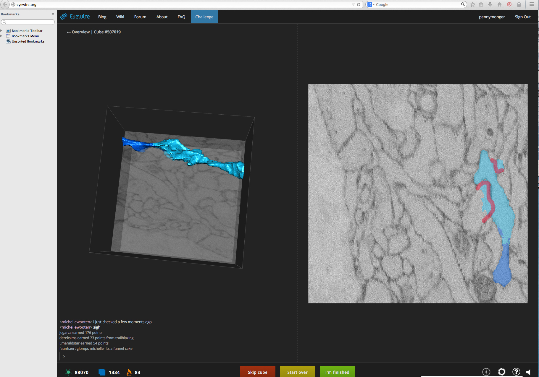
The 3D cube has a minimum size, then it disappears! It’s huge when it appears so I have to resize it each time. I prefer the 2D a bit bigger to catch the tiny areas.
Unless there are more tool options, the paint spectrum is hard to find…
1 Like
hseung is in Spain at the moment 
I’m glad the general reaction is positive.
I wasn’t sure if people were actually using shift click for deselect – I’ve always found right click easier with a mouse or trackpad, but I hadn’t considered the user experience when using a tablet.
Custom keybindings have been on my agenda for a while: I’ll work to implement them over the next two weeks. Hopefully that will make things better for you.
1 Like
If you’re on a mac, try holding command while painting to erase. If you’re on a pc, try holding ctrl while painting.
I don’t have a pc in front of me to test, so please let me know if this works.
1 Like
I agree with @mkwak’s suggestions. The 2D window image does feel considerably smaller than it was and I’m not sure the 3D needs that big a size. I notice we can’t close the 3D window anymore. Very hard to read your own name in the leaderboard too, with the green highlighting.
I’m on a Retina Macbook Pro which uses gestures on the trackpad. Interestingly, I can scroll through the whole image (2D and 3D) incredibly fast for a quick overview, but when I then try to go through slice by slice (up arrow), it is quite slow to load each one (possibly slower than it was before). At first I was excited when I saw it zoom through the whole thing, thinking it had cached that quickly, but it doesn’t appear that is correct.
Seems that command is working for the right mouse when I try it today. Didn’t seem to have much luck with it yesterday and had to use the trackpad gestures, but it seems fine now. I agree, right mouse on a 3-button mouse is very easy. I wonder if there are still people out there who use one button mice (I’m thinking of Mac’s here). Anyway… custom keybindings would be good. Great work you guys…btw
1 Like
The shift key for hiding paint still feels clunky to me, but I guess it depends on how you work. I used to toggle it off and on and with the l/r arrow keys constantly while I was marking… finding it useful to zoom through many images without the blue to see the neuron clearly and double check what I was adding. Now that means holding two buttons at the same time. Anyway, if you are setting up custom keybindings, then that’s fine - everyone can set it how they like.
1 Like
So I’ll work on making the dividing bar moveable so you can resize how much space you give to 2d&3d.
We wanted to equalize the size given to 3d because people seemed to not be using 3d. Folks were making a lot of mistakes that could easily be identified in 3d, so we wanted to emphasize that 3d context plays a crucial role in solving this problem.
Now, it’s interesting the 2d view feels much smaller, because it probably isn’t. On wide-screen monitors the 2d panel is almost the same size as before (the top and bottom bars are now 48 pixels taller than before, and the vertical dimension of the window is typically the constraining dimension). It likely just feels smaller in comparison to the 3d, but you can see nearly as closely as before.
1 Like
I noticed that once I start playing, there isn’t a place for “logoff”. I have to go to another screen to do so. There are elements of “Start Playing” screen that should be in the “Play” screen.
Personally, I like the 3D popout option. That’s cool.
1 Like