Eyewire UI through time

Hi all!

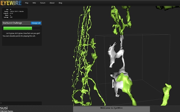
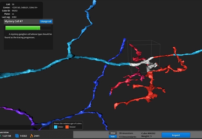
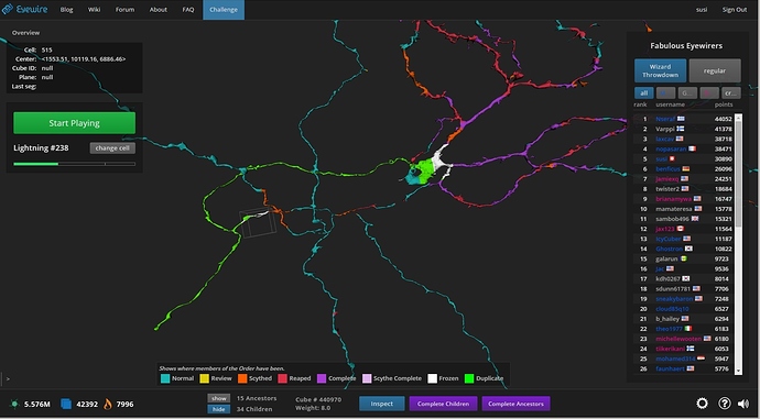
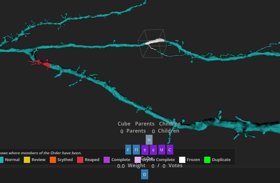
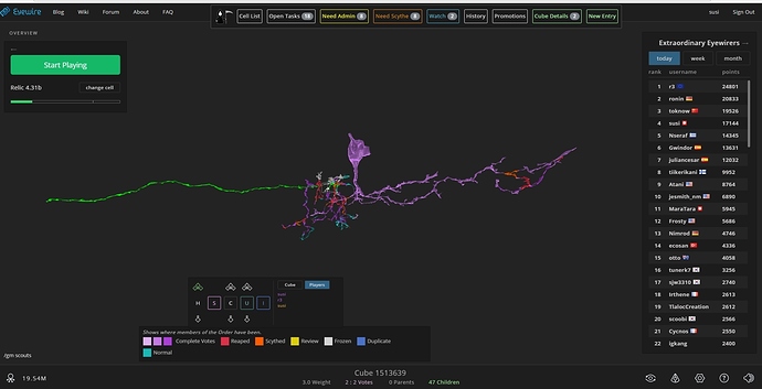
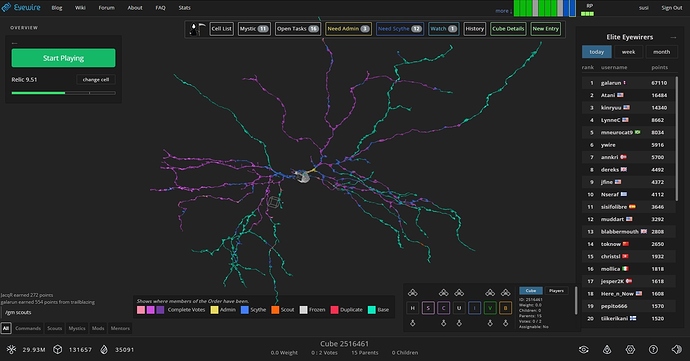
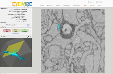
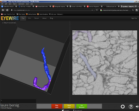
I was going through the gallery of amusements and noticed the evolving UI over time, so I grabbed screenshots as things changed and thought everyone would find it interesting to see how much it’s changed over five years!

Note: I couldn’t find a screenshot of the original UI, back when the background was white, apologies.
.
.
December 2012
.
.
.
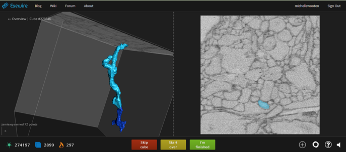
October 2013
.
.
.
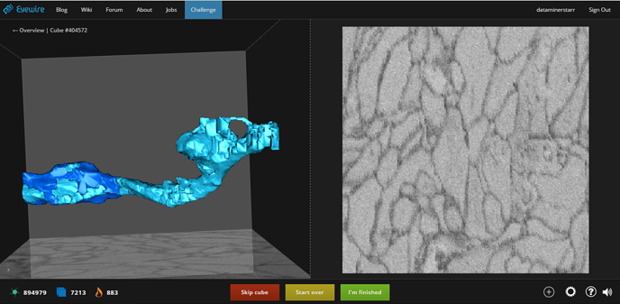
September 2014
.
.
.
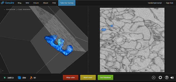
November 2015
.
.
.
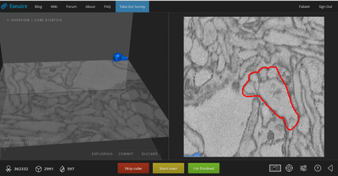
March 2016
.
.
.
June 2016
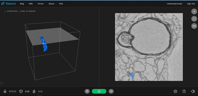
.
.
.
November 2017

.
.
If anyone has any screenshots of any iterations I don’t have included here, add them in the comments along with the date (month and year) and I will add them in their proper spot in the timeline!

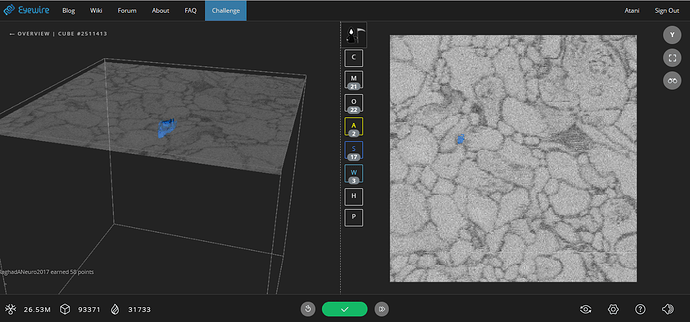
4 Likes

my fav. is 2015 and before lol, nice clear buttons with text and no guessing what each minutely sized button does. lol

1 Like

Lol. My favorite is 2014, look at all the color! And I miss the old-school text. :smiley_cat:

I cannot imagine trying to play this with a white background, i’d think it’d cause mucho eyestrain. :scream:

1 Like

yeah the white background must have been excrusiattingly painful lol

1 Like

Ayy my screenshot’s there lol

2 Likes

You’ve got a couple there!

1 Like

I add here UI of overview over time, mainly as showing for scythes.
.
.

May 2013

.
.
.

July 2013

.
.
.

April 2014 new heatmap

.
.
.

February 2015

.
.
.

August 2015 new toolbox
December 2015 new log Eldendaf

.
.
.

September 2017 new colors and applications TamperMonkey

2 Likes

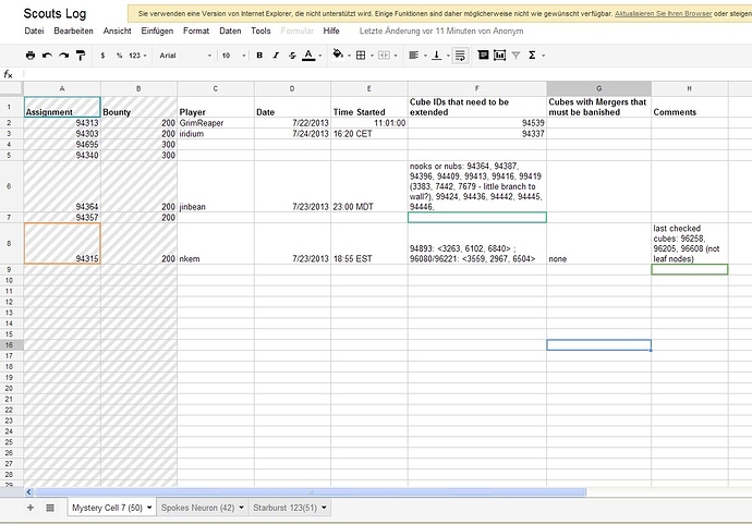
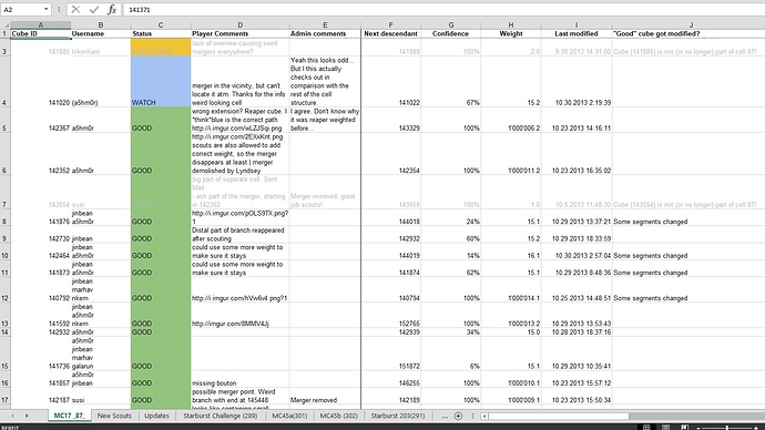
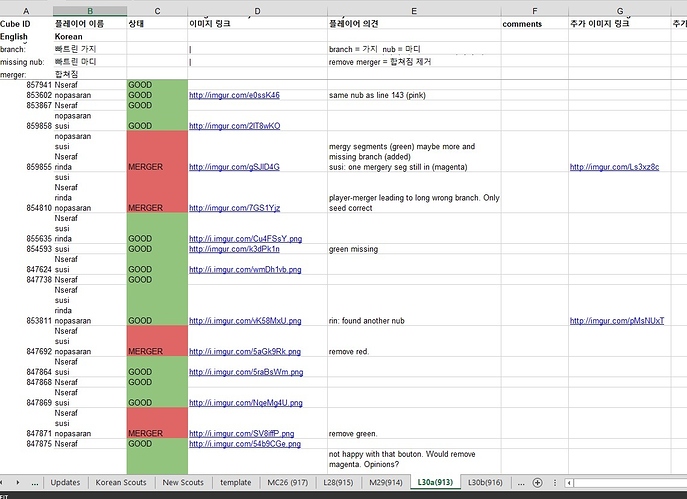
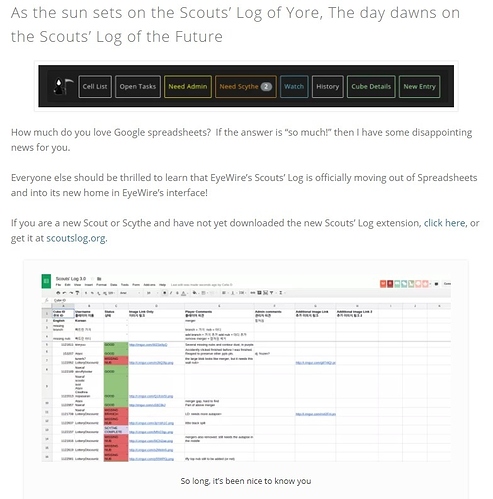
And here the development of scouts/scythes-log:
.
.
.
July 2013

.
.
.
September 2013

.
.
.
May 2014 scoutslog 2.0

.
.
.
February 2015 scoutslog 3.0

.
.
.
December 2015 log Eldendaf

2 Likes

It’s hard to believe we’ve had the integrated scouts log for two years already!

2 Likes

These are so cool! Five years of Eyewire - it’s easy to forget how much it’s changed since the days before profiles and Scythes; heatmaps and scoutslogs!

@Atani crazy how in-cube doesn’t really change between Oct 2013 and June 2016!

@susi wow that original inspect UI from 2013 back when you had 1.6 M points :slight_smile:

It’s also so cool how long so many people have been participating. There are even still HQ people from before J Day!

1 Like

Thanks for the time machine experience guys! Really cool to look at Eyewire’s progress over time :slight_smile:

1 Like

utube time warp, Who are those kids ??? :slight_smile:

4 Likes

This is great!!

2 Likes

Can someone do a gallery of the explore page? Too lazy to do it myself lol
https://web.archive.org/web/20120801000000*/eyewire.org

1 Like

I just came arcross this video showing UI as of July 2013 - just a week or so after we debuted profiles. Check out #1 on the leaderboard @susi

And here’s a demo of the original heatmap that was admins only, also from July 2013, before there was Scythe Vision http://blog.eyewire.org/eyewire-heatmap-demo/

And if I remember correctly before clicking on name produced a profile you used to be able to see where someone was in a cell by clicking on their name? lol

I believe it showed what cubes they had worked on (similar to if you hover to over their name in the leaderboard right now). But we’ve never had anything that showed where someone was in a cell in real-time… one day perhaps!

3 Likes

I’m surprised no one has dug this up from the wiki yet. This was the UI shortly after I joined Eyewire:

4 Likes

lol omg that’s the “white background” phase? I’d be needing eye surgery every day xD this is almost like OMNI interface i’ve seen pics of lol