Mr. Bug Reporter is back, and I gotta say, thanks for the update! I really like the solution for the chart, and, after making a script of my own for making minor adjustments, the profile looked PERFECT. 
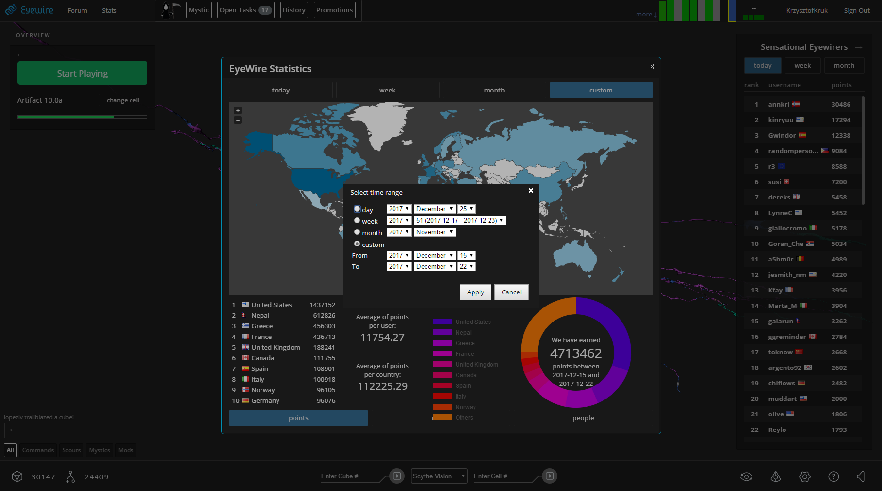
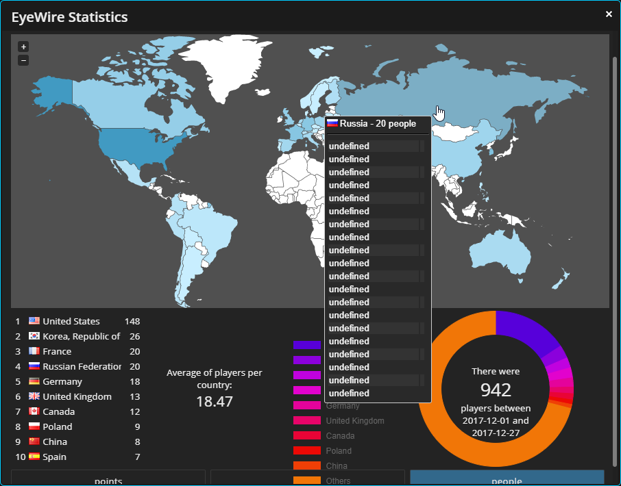
However, with some bug fixes comes more bugs. For example, the gap between the buttons are still absent, and while playing around with the custom stats, uhh,
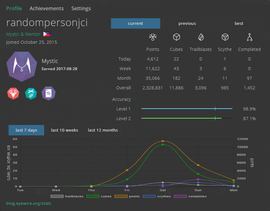
This happened lol (It affects custom only and it’s also a problem for points and cubes). But overall, I really like the new features and fixes, and once again, thanks!
Edit: I just realized that the map does not automatically center when resizing the stats window, and the legends for the colors overlap on top of the points, cubes, and people button, so
This happens This happens
Edit edit: It turns out that the overlapping legends were because they randomly shifted down, and after a few reloads, it now fixed itself, so yay to that
Anyway, I made some code of my own that fixes some of the problems I mentioned.
$('head').append(`<style>
li:not(#acc) {margin-left: 2px; margin-right: 2px;}
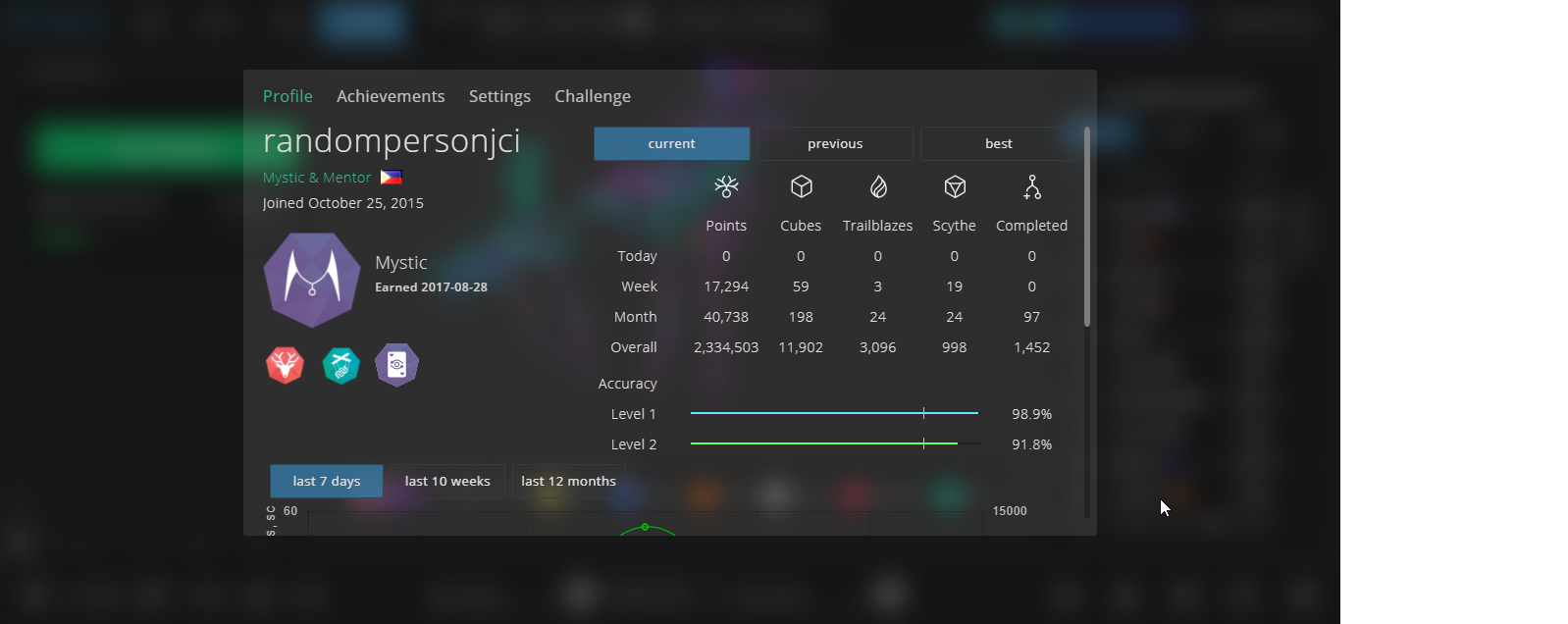
#profileContainer {top: -10px;}
#profStatsAbout {font-size: 0px;}
#ewsWorldMap {position: relative; left: 50%; -webkit-transform: translateX(-50%); -ms-transform: translateX(-50%); transform: translateX(-50%);}
</style>`);
The 1st line is to add the margins on the top buttons, and 2nd line is to position the profile so that the entire window can be seen, the 3rd line is to remove the stats link at the bottom of the profile, and the last line is to center the map, even after resizing.


 so i want it gone somehow lol so I somehow have to be able to find it and then inspect and reap it to kingdom come
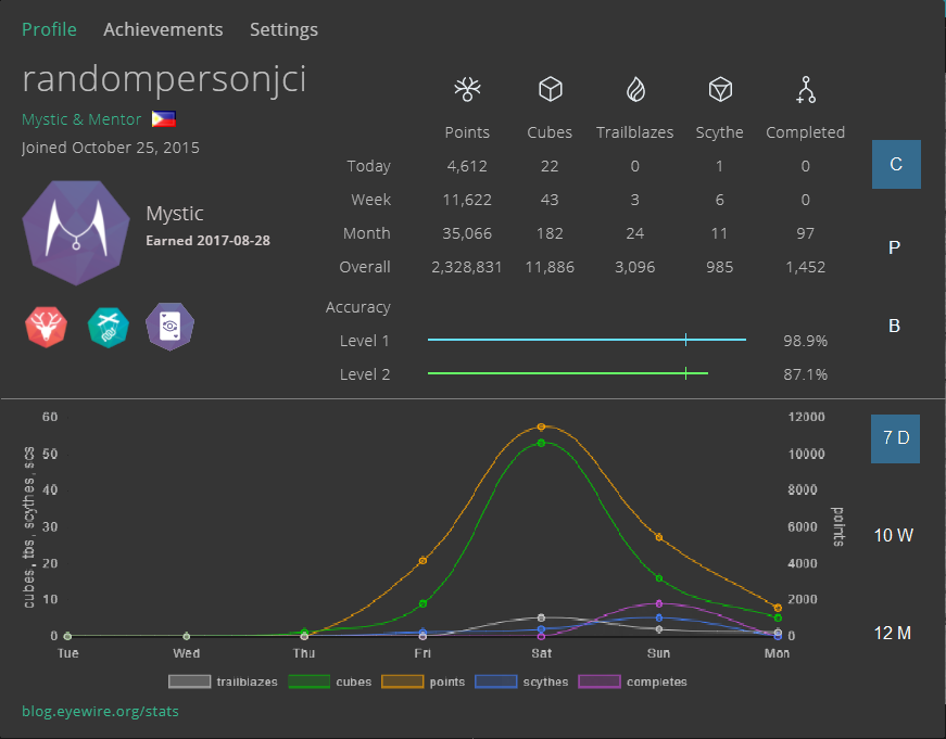
 )
) I now understand about the buttons and the custom date, but about the chart height, will the width also change to keep the aspect ratio? Because the purpose of the proposed design is to keep the window height the same small size while keeping the aspect ratio of the chart and prevent it from looking “squashed”.