Ok, I played a bit more after the beta and here’s my feedback:
I would actually prefer to jump to the cube in overview when clicking on the accuracy bar instead of immediately being put into the cube in inspect mode. I’m getting a definite lag when being placed in inspect mode that i wasn’t getting when jumping in overview. As well as, it’s more helpful to me personally to see how a cube fits into the cell overall (as well as see if there’s some wonky ai madness going on) and how it relates to its parents, without esc to ov then going back into the cube.
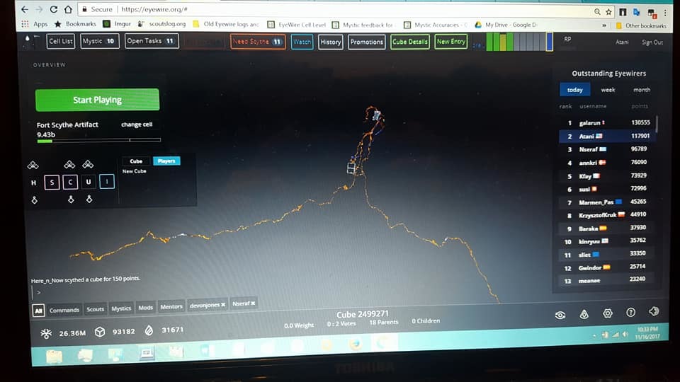
The rest is appearance based. I like how close it is to my name on the screen, will allow for a more comfortable fit of the SL bar. I do think it would be nice for the bars to be wider, as well as color coded for the accuracy %. Gray on Gray doesn’t exactly pop.
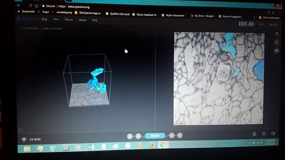
Pics of how they compare on my laptop:
This is KK’s. The bars are easy to see, and pop with their colors.
The integrated one. Can see them, but it is not as easy to see the slight variations in % just by glancing at the bars as it is in KK’s. And, while it is sleek from a design stance, it feels less personable.
Just my 2 cents, i’m sure i’ll have more feedback when I get to mess with it more 
PS: fwiw, those are pictures of my computer screen, not screenshots. Learned that what I see is not what y’all see through a screenshot


 lol, first post